Earth House Hold's, Never Forget Us had a unique process behind the artwork, so I thought it would be worth telling the story behind it.
Brock and I went around in circles for a few months trying to land on an iconic approach for Never Forget Us (often, with ASIP releases, the artwork takes longer than the music). Some artists have a very clear brief or idea for what they would like to see, but Brock wanted my take on the artwork too (I always try to collaborate as much as possible on artwork and appreciate whenever artists ask for my input and this album was a special piece for us both). We ended up going back and forth for a significant time, before we finally decided to use some amazing photography by Mamii - a close friend of Brock's.
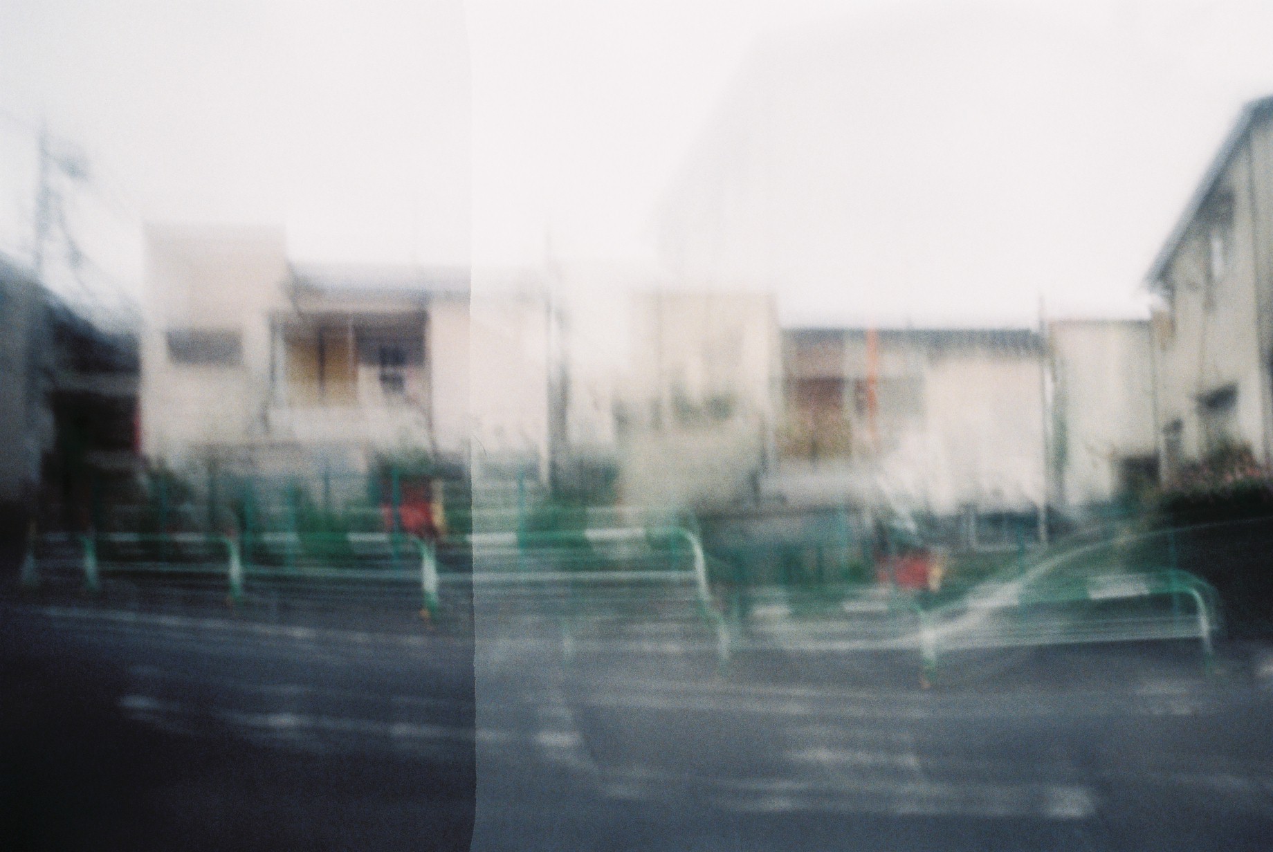
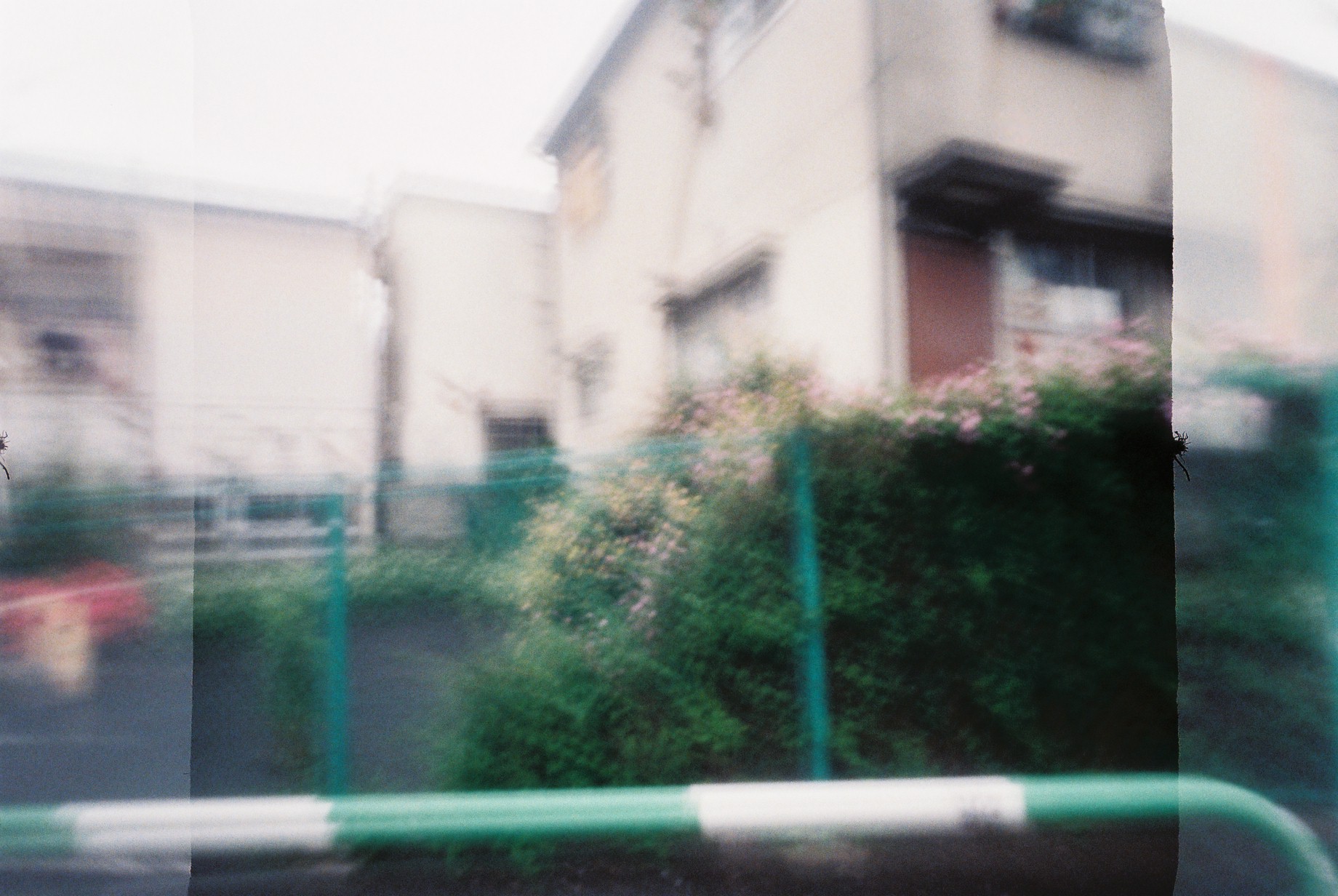
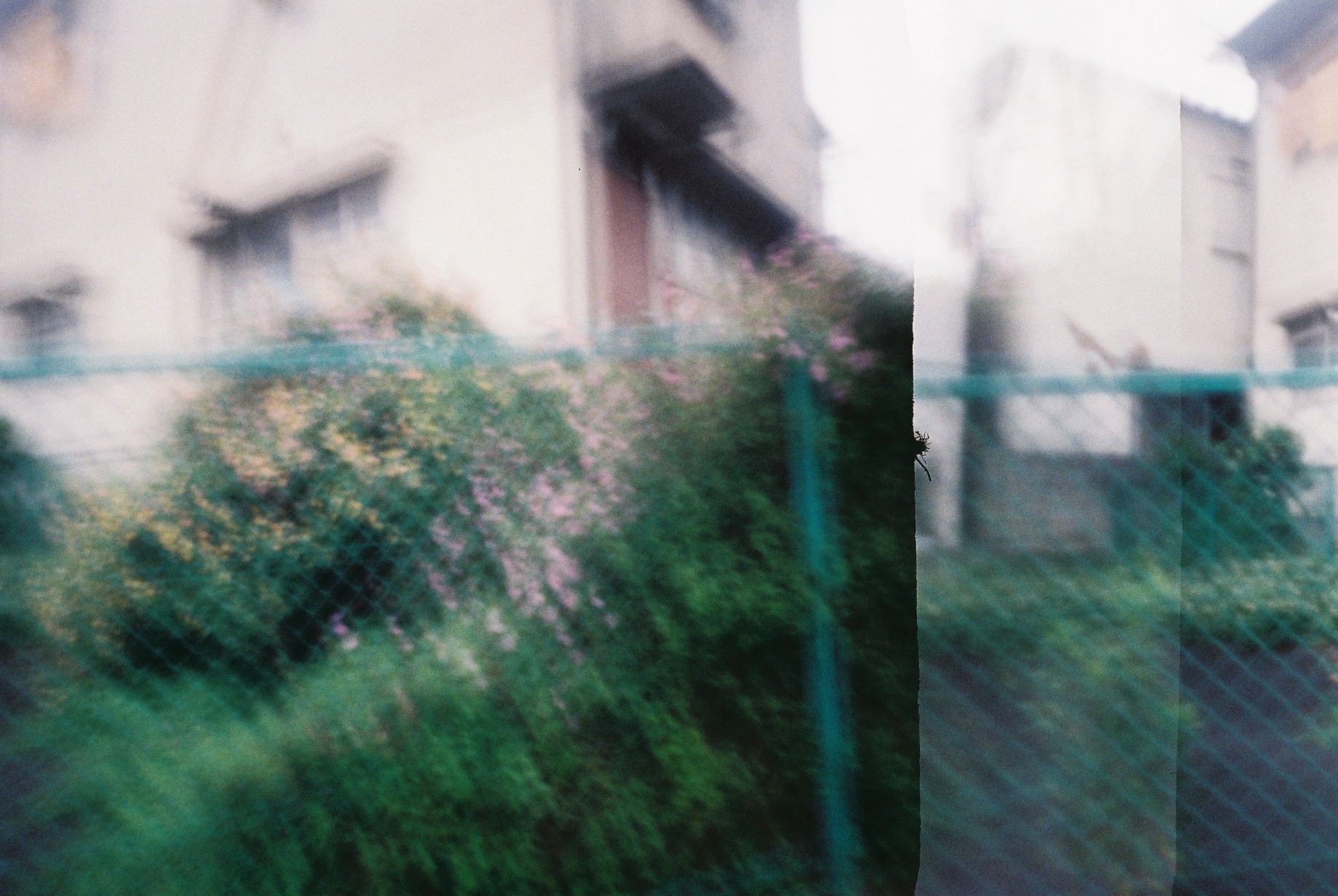
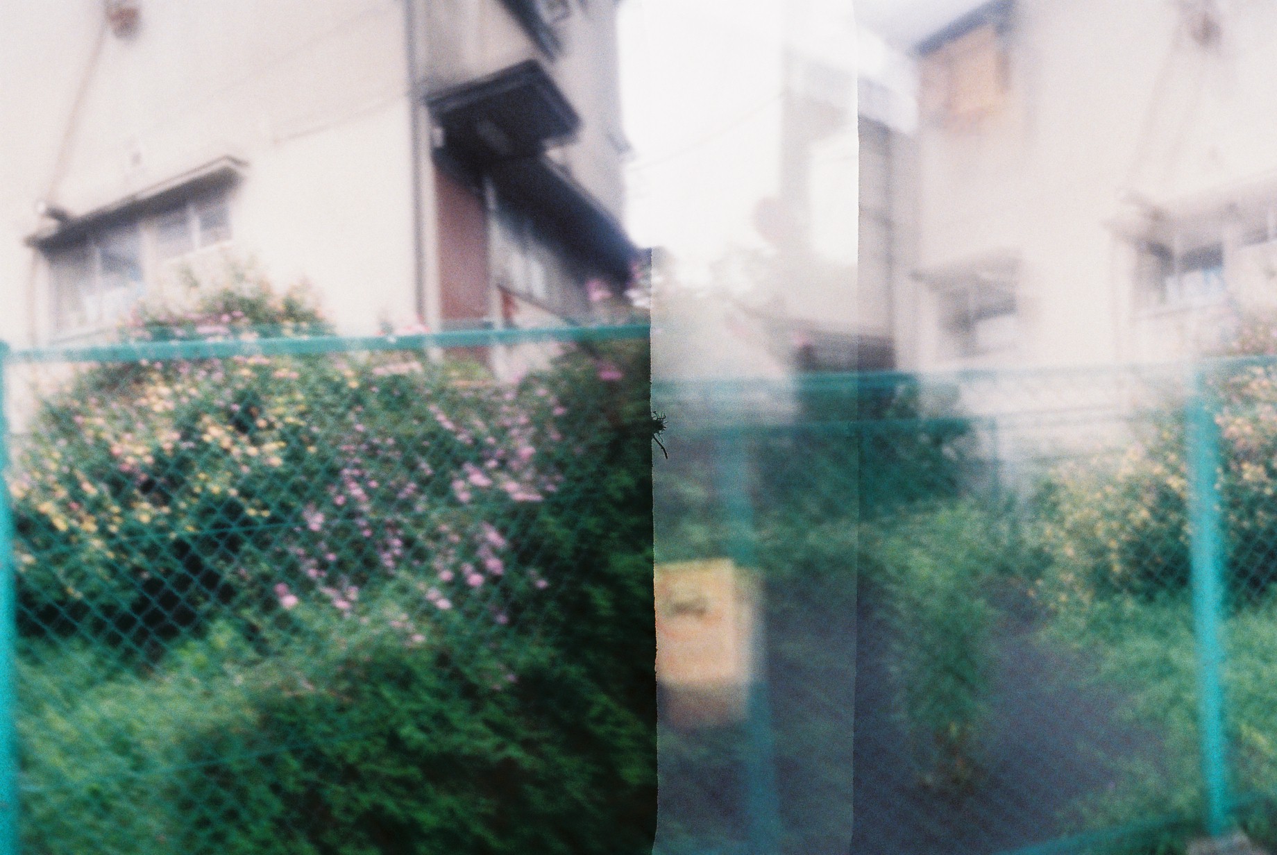

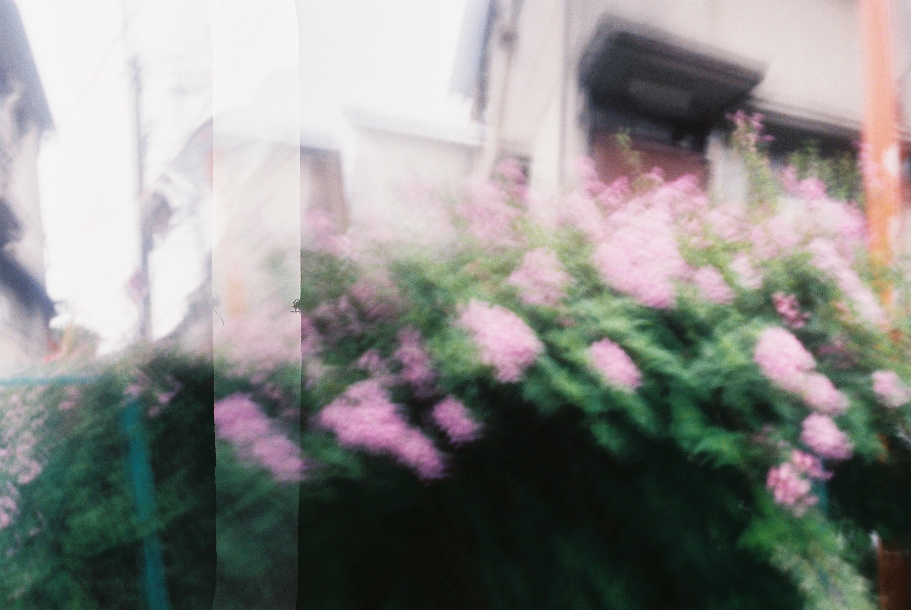
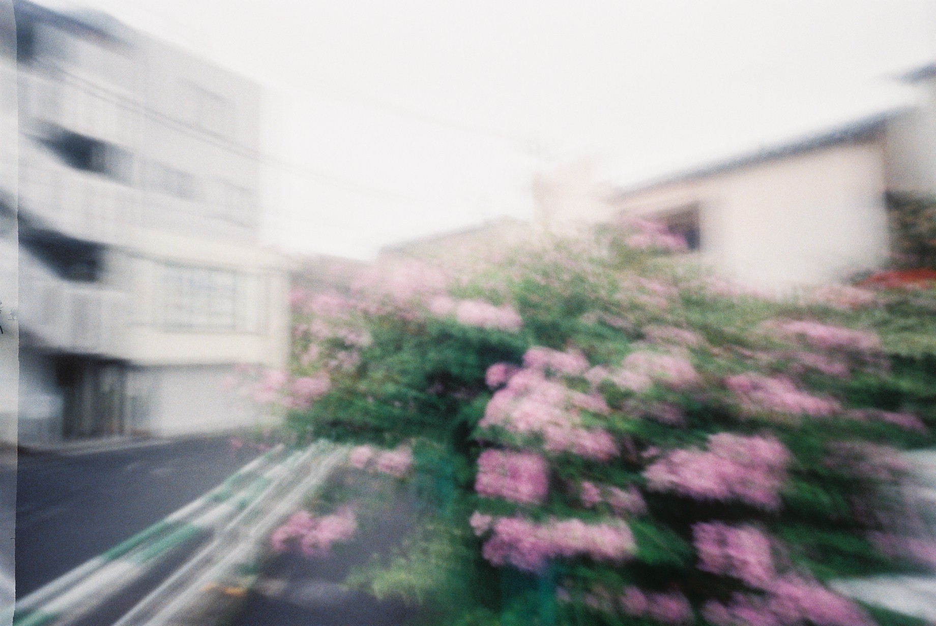
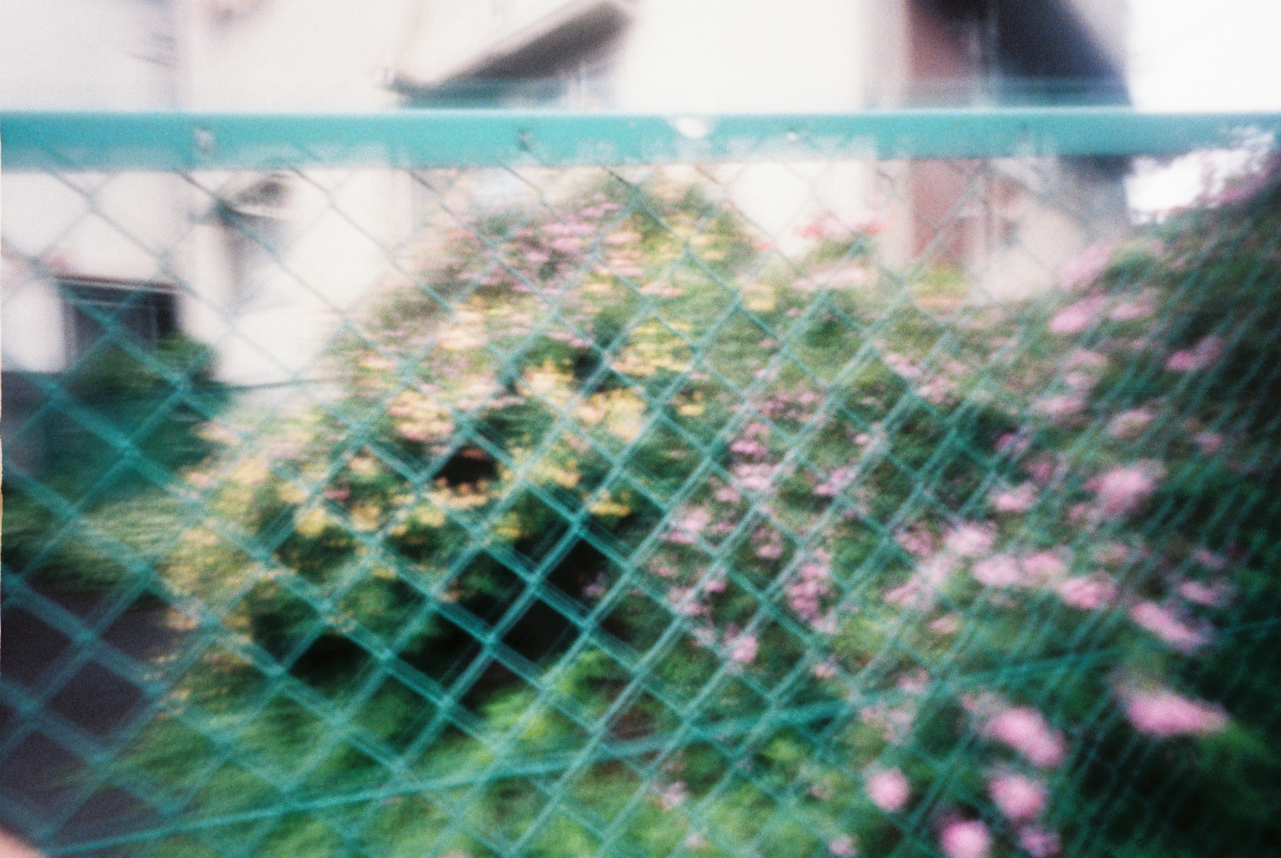
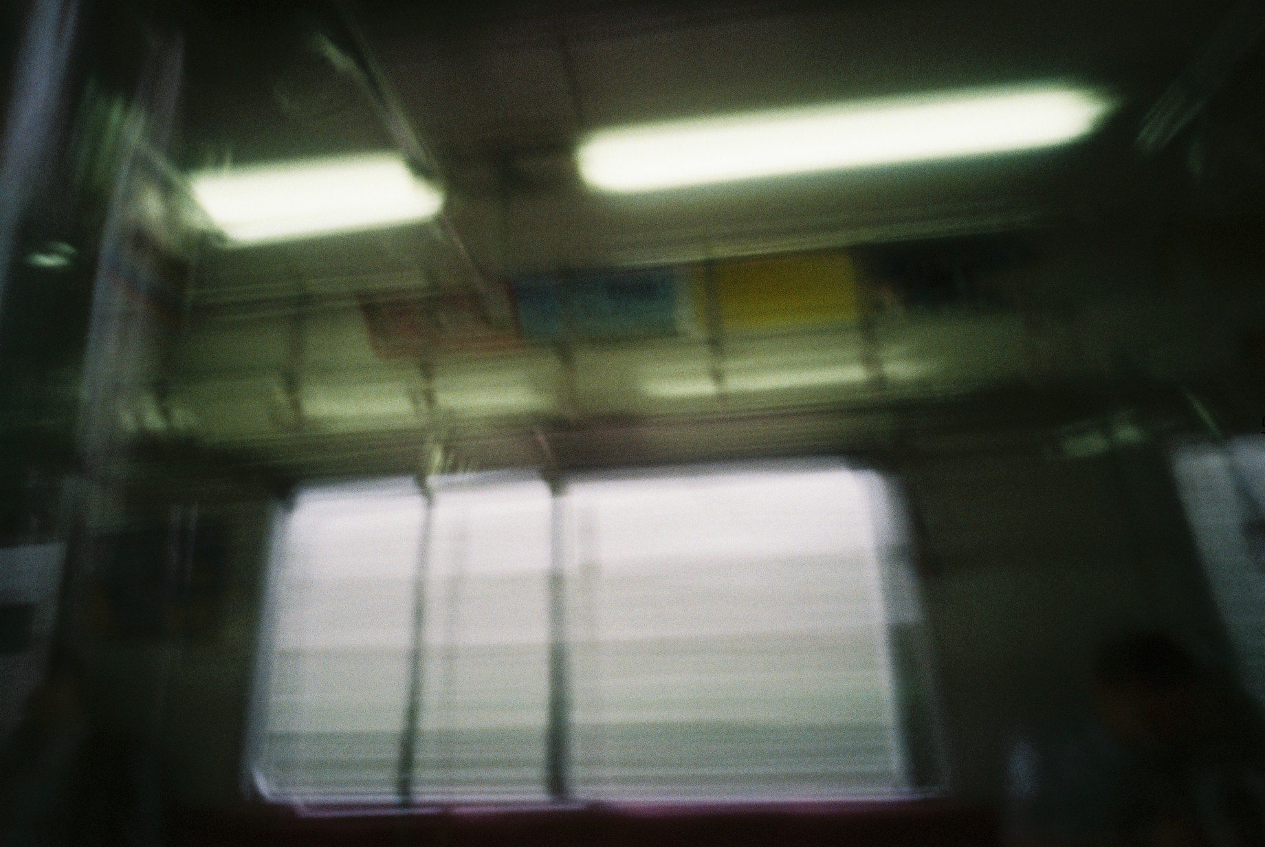
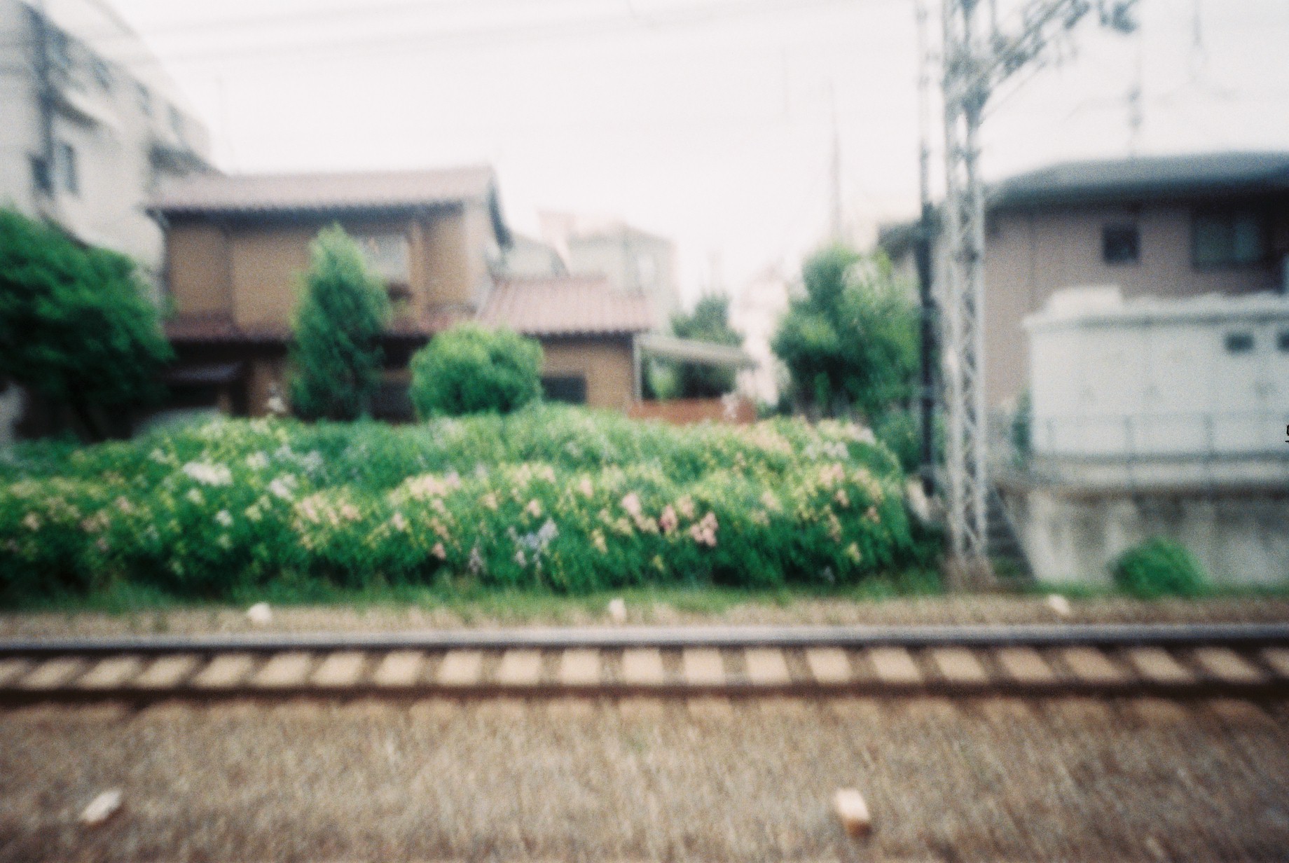
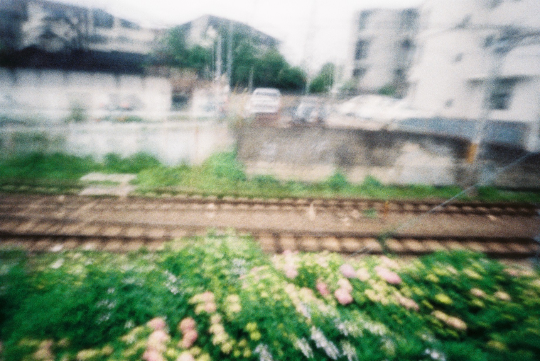
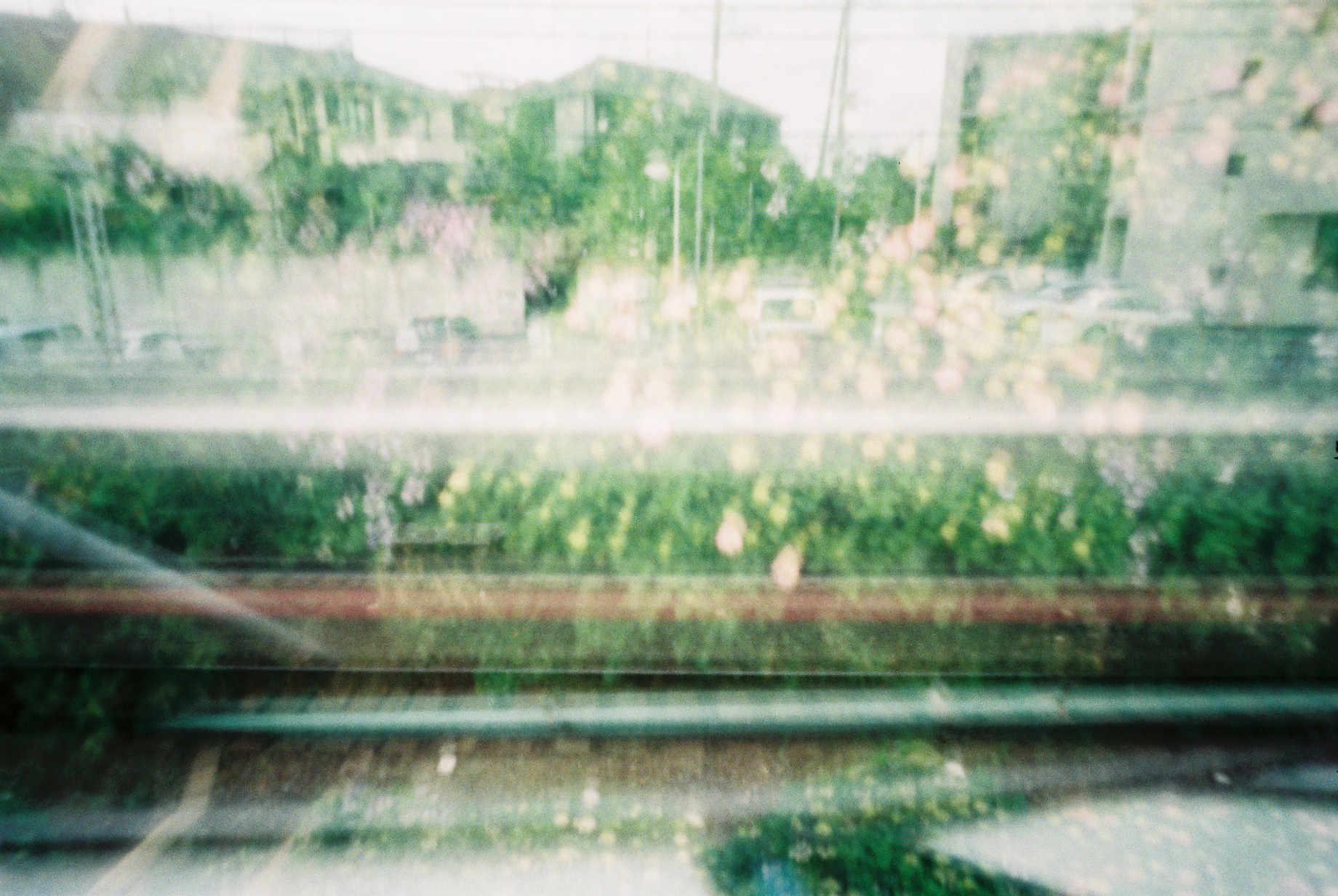

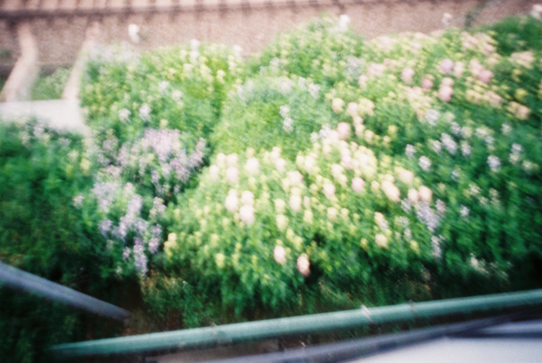

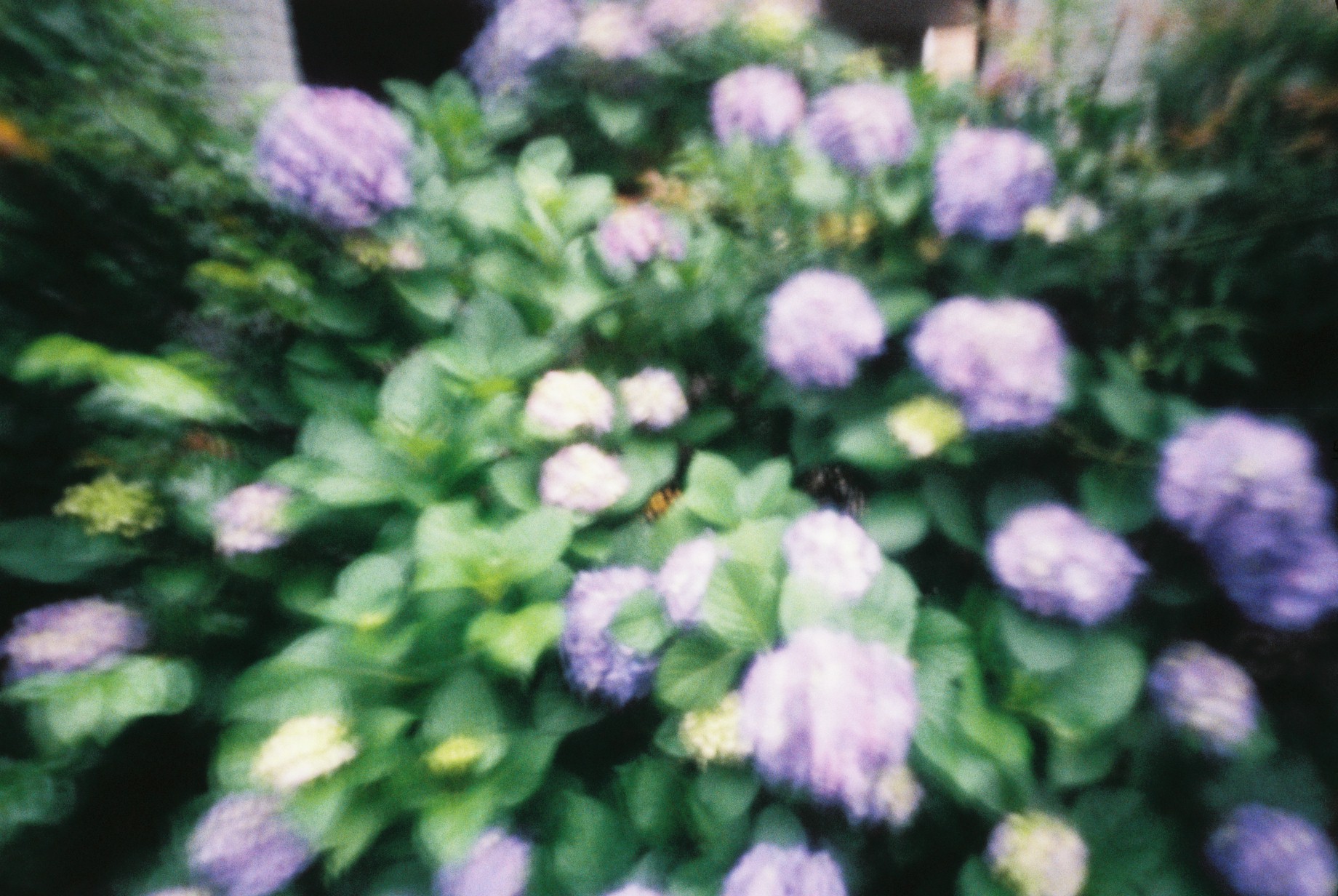
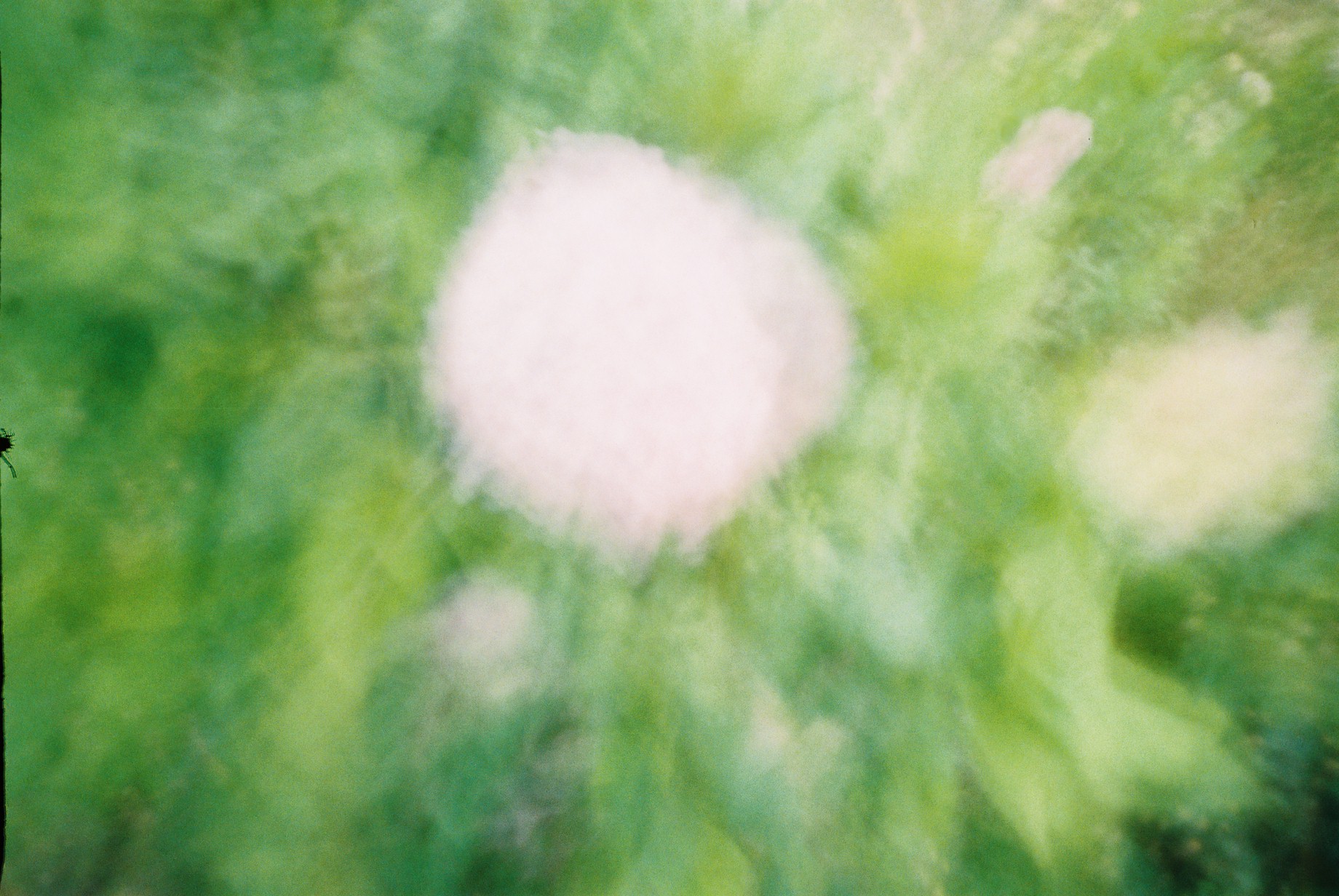
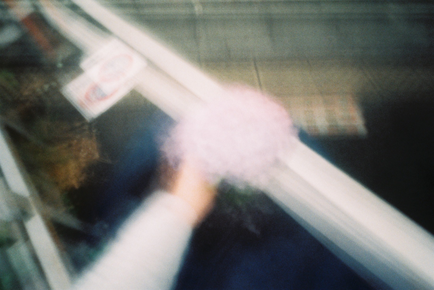
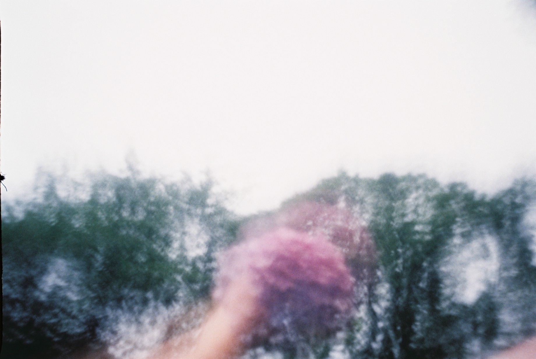
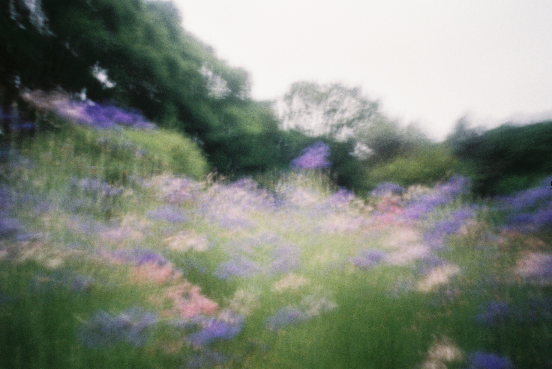
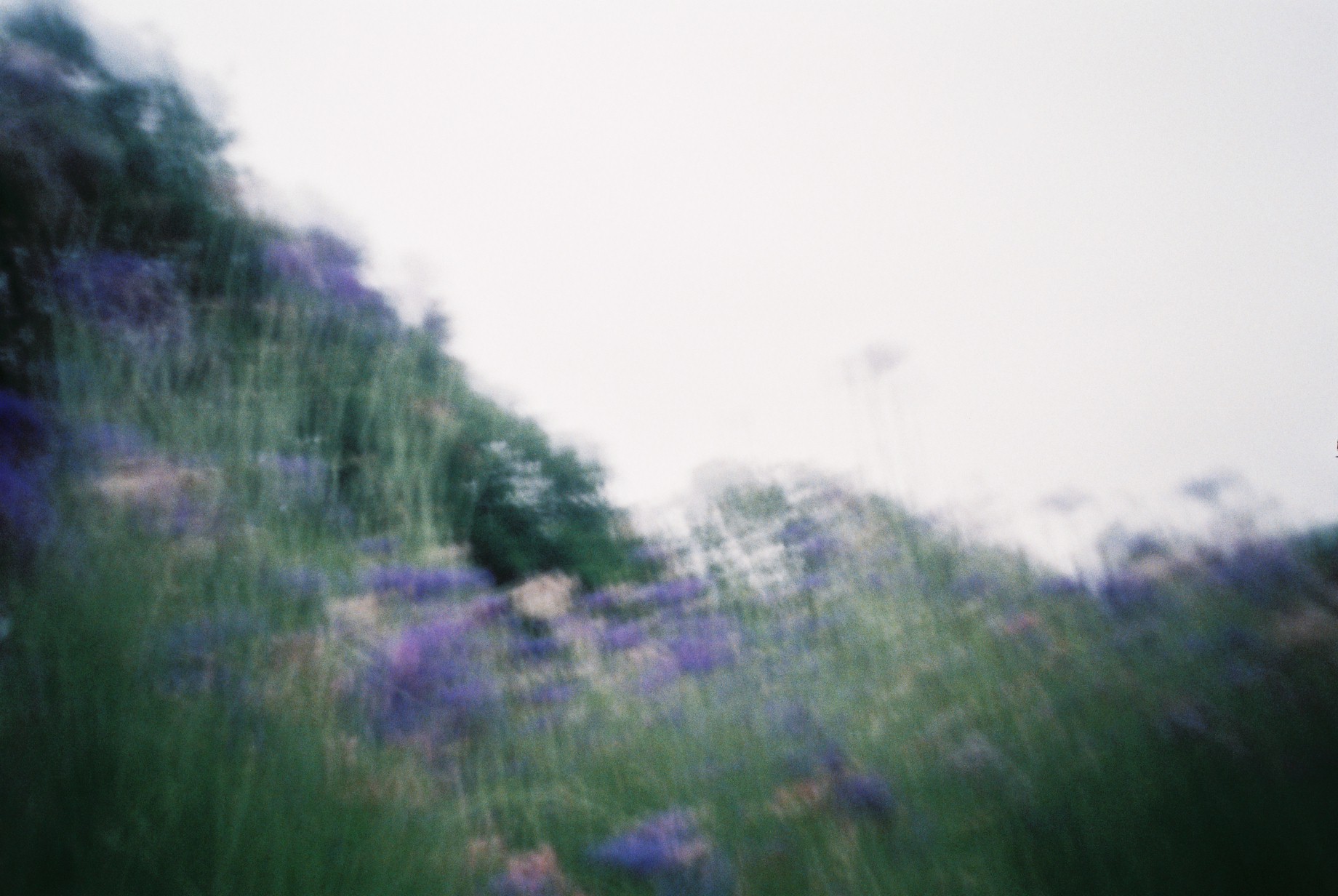
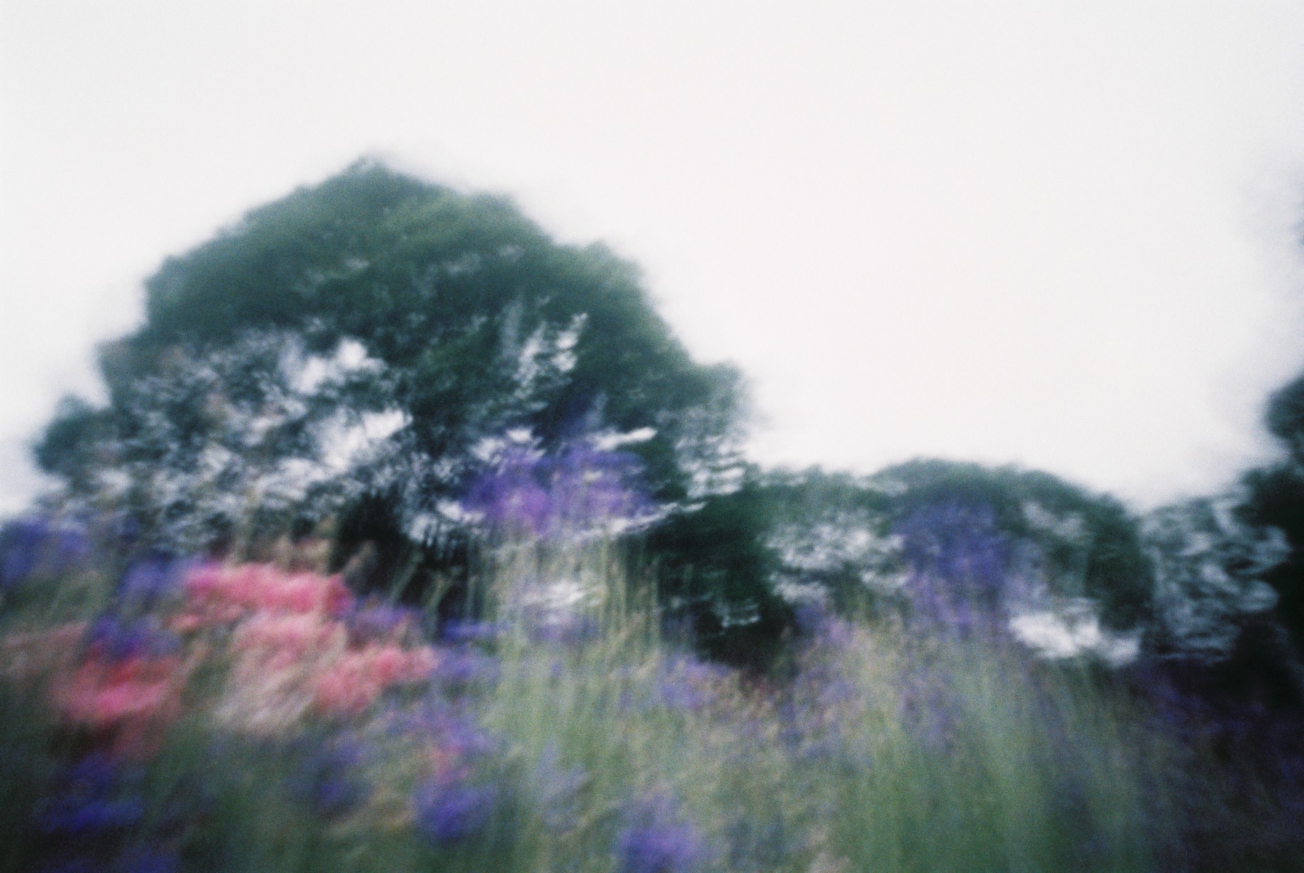
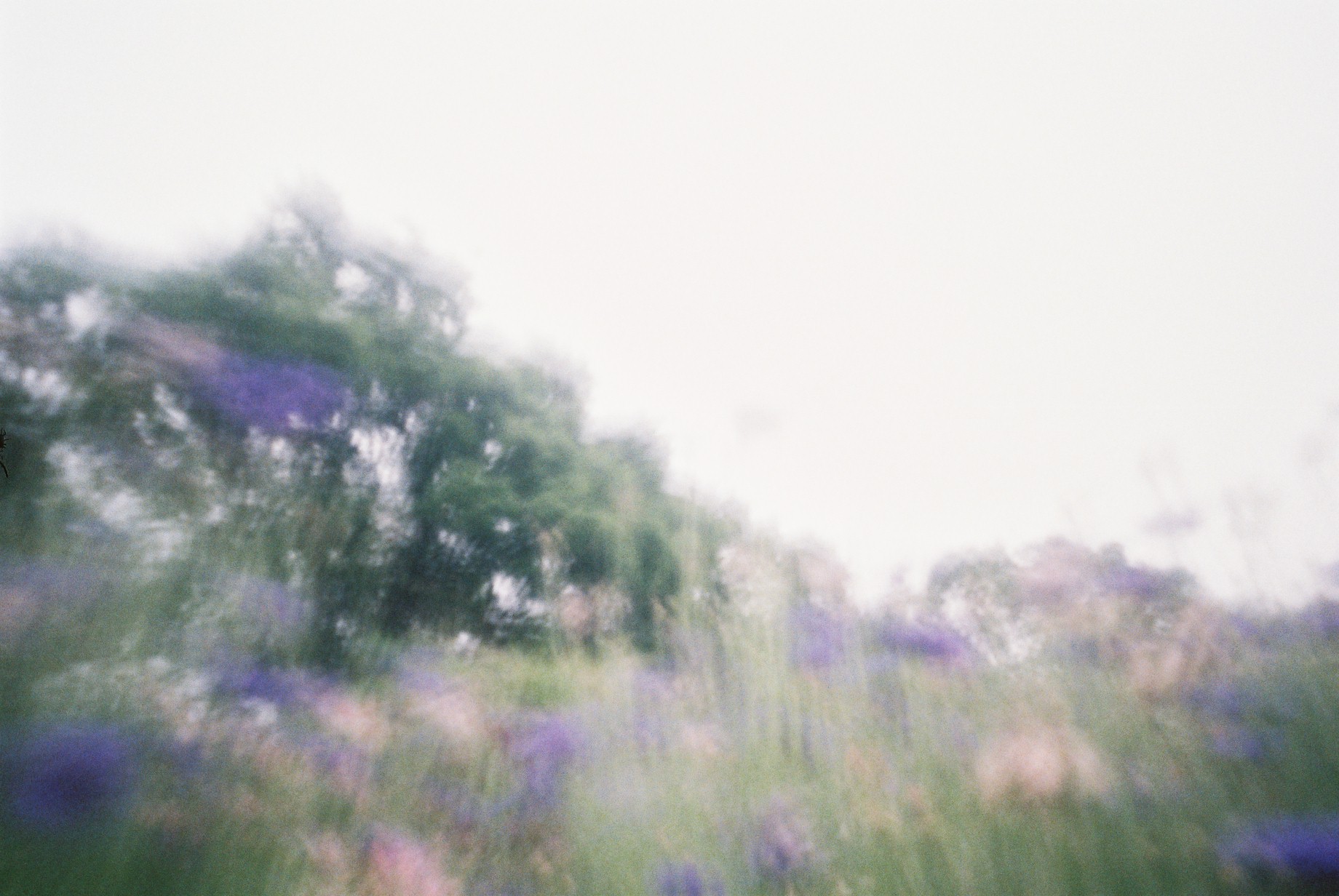
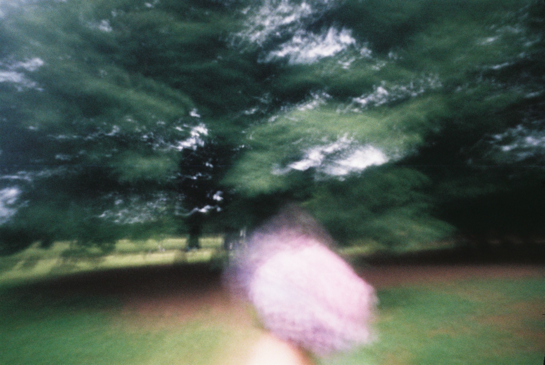
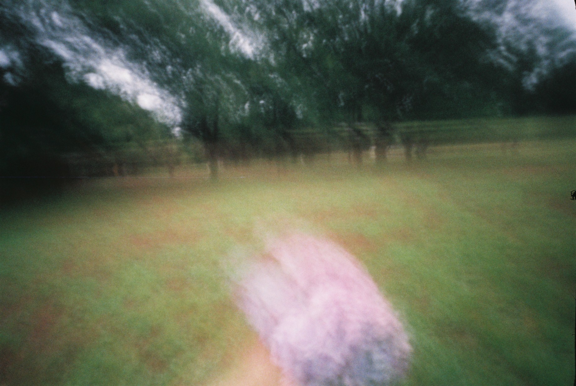
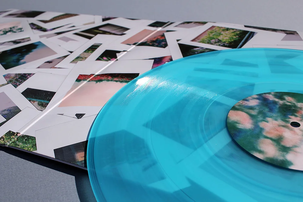
Mamii's photographs - a sample selection show above - were taken using a pinhole photography approach, giving them their unique, warm and 'in-motion', blurry feel. For anyone close to Brock's previous releases, you'll see a common theme and style in the photography he chooses and these photographs were a fitting tribute to his past, while offering a new perspective for his new record.
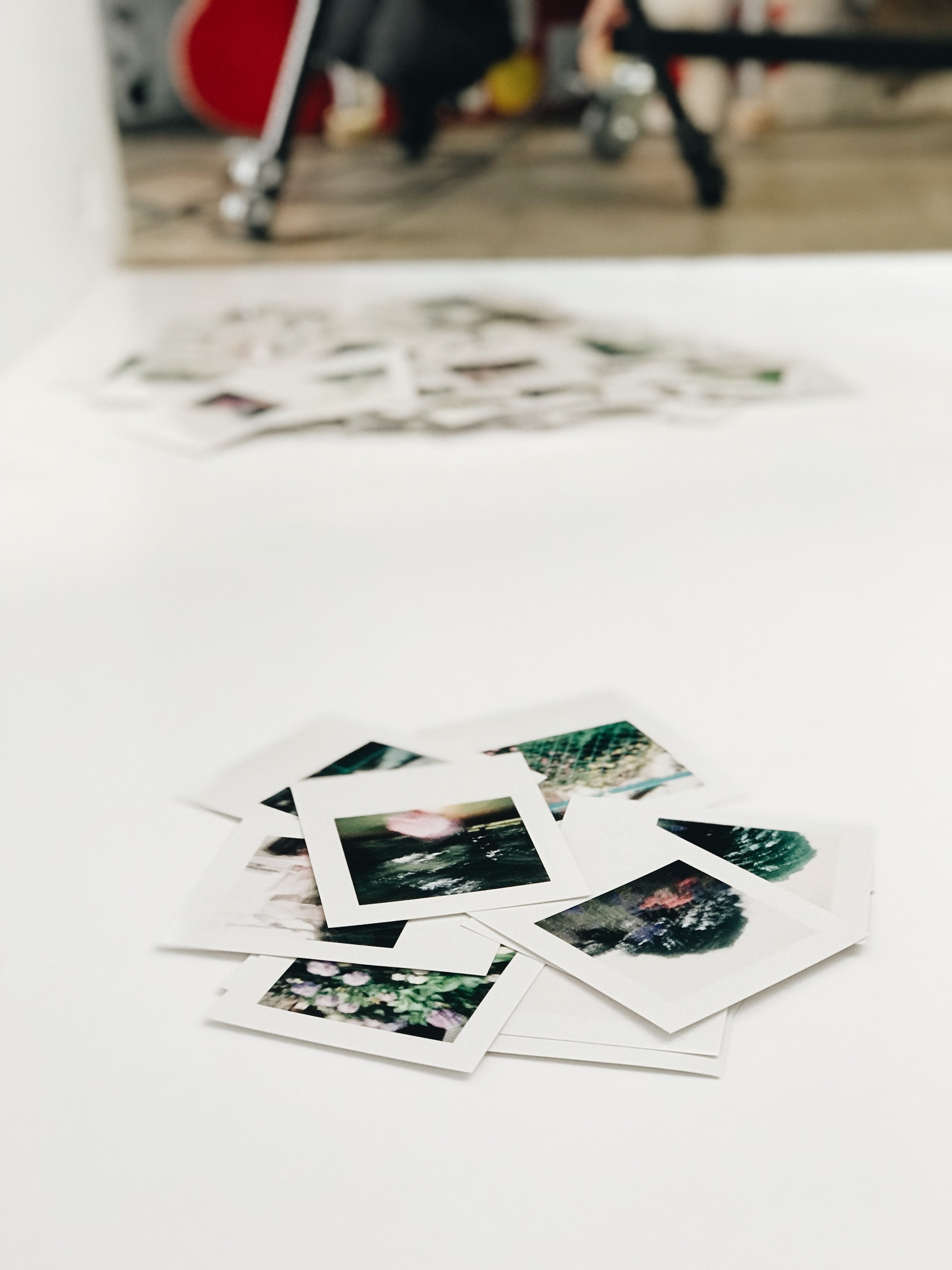
Brock sent me scanned copies of the original photographs, which I then replicated and had printed again as polaroids (meta!) - around 50 different images, with 4 copies of each (200 total). The idea we had, was to shoot the photographs from above to create an abstract and detailed pattern for the front and inside vinyl artwork.
Close up, you'd see the many memories. Far away, it'd become an intriguing pattern.
I asked my friend, designer, photographer, Mike Marquez to help out with the photography, styling and ultimately the layout. We jumped into the studio, and despite my original idea to shoot just a couple of photographs on the front, it seemed a little forced and empty behind the camera, so we began to throw more and more photographs on to the pile.
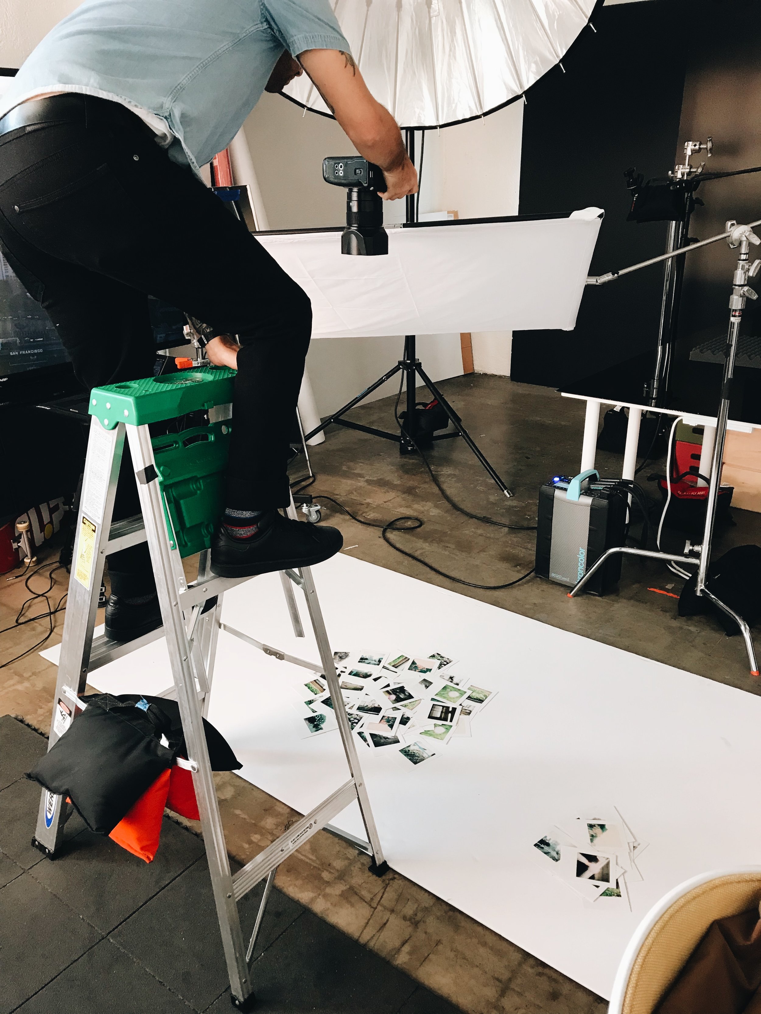

When you try and make something like the above appear natural and random, it becomes harder then you'd expect. We spent most of our time rearranging the photographs so that the imagery, colors and detail were balanced across the spread. Throwing photos from above and letting them land naturally, then fussing over the details. Mamii's photographs ranged from cityscapes, to views from a train, flowers, fields and a house, so I decided to try and keep similar subjects close to each other to tell a story as you followed the overall pattern.
Once Mike and I were happy with the front, we continued to add more photographs to extend the same approach for the inside gatefold. I always try to provide additional detail, and a new layer to the story with the inside gatefold on our releases. With this one, it was easy to extend the story we started on to the inside.

I originally imagined the edges of the photos to signal the edges of the pattern on the front, but we decided that it looked better cropped into a square - appearing cleaner, and also giving the impression of a window into the journey (gatefold) inside.

Once we aligned on the front and inside layout, we then had to tackle the vinyl color.
For those that are wondering, vinyl color choice is not taken lightly for ASIP releases... aesthetics and quality are always considered side-by-side.
Rarely do we know the color of vinyl before aligning on artwork. If we want it to compliment overall, it makes sense to decide after, but sometimes the artwork really doesn't help with the vinyl color decision or point to an obvious color. Case in point here due to the many colors included in the photographs. Potentially, too much choice...
To make matters worse, I have to try and decide on a vinyl color using small samples (I'm lucky enough to have these - many people don't), which appear slightly different when photographed - so using vinyl plant catalogs and sending pictures over to the artist is never an exact science if you're looking for a perfect color match. The listed Pantone references they provide are nothing like the real thing in many instances either, so coloring them in a mock in photoshop is never realistic enough.
I ended up sending Brock several of the below photographs that showed a sample set against a print out of the artwork mock. I now realize, I'm taking photos, of a photo, that has multiple photos, reprinted as polaroid photos, that were scanned photos, from original pinhole photos....
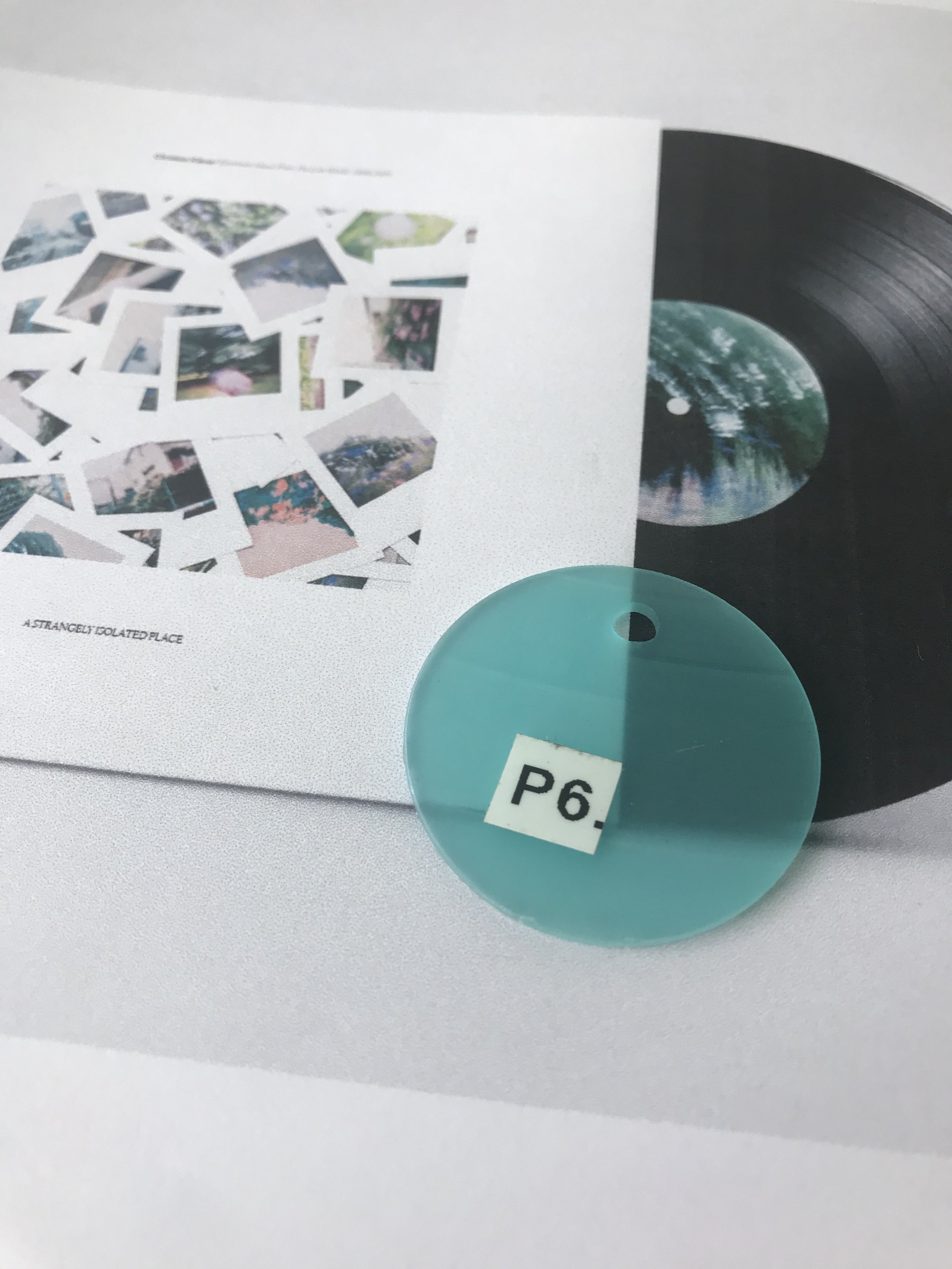

Those with a keen eye, may see that we ended up going with the above transparent blue (which actually photographed a little turquoise above, but ended up even better than imagined in real life).
Once the vinyl color was decided, the order was sent... then, it's in the hands of the vinyl gods, as we wait for anything up to 3-months to see your creation - hopefully - turn up looking just how you wanted it. This one did.
Lastly, I had a selection of Mamii's photographs printed on very high quality card and placed inside the package for anyone who purchased the record with me direct on Bandcamp, as an added bonus.
Thanks to everyone who has purchased the record and made some very kind comments on the artwork (and the music, of course). And thank you to Mike for his helping hand, photography and keen eye.
Buy Earth House Hold / Never Forget Us.
Watch a video using a selection of Mamii's photographs, here.